Newsletter Design and Content Ideas from Big Brands
Newsletter design and creative content are essential components of successful email marketing campaigns. Keeping up to date with design and content trends can help improve your subscriber’s engagement and conversion rates. If your newsletter disappoints you mightn’t get the results you were hoping for. And if your newsletter exceeds your subscriber’s expectations you can benefit with a higher click through rate, improved engagement and higher conversion rates. There is no “one size fits all” though. Your newsletter design and content should be tailored to your email marketing goals. Let’s see how some big brands are doing it.
Booking.com
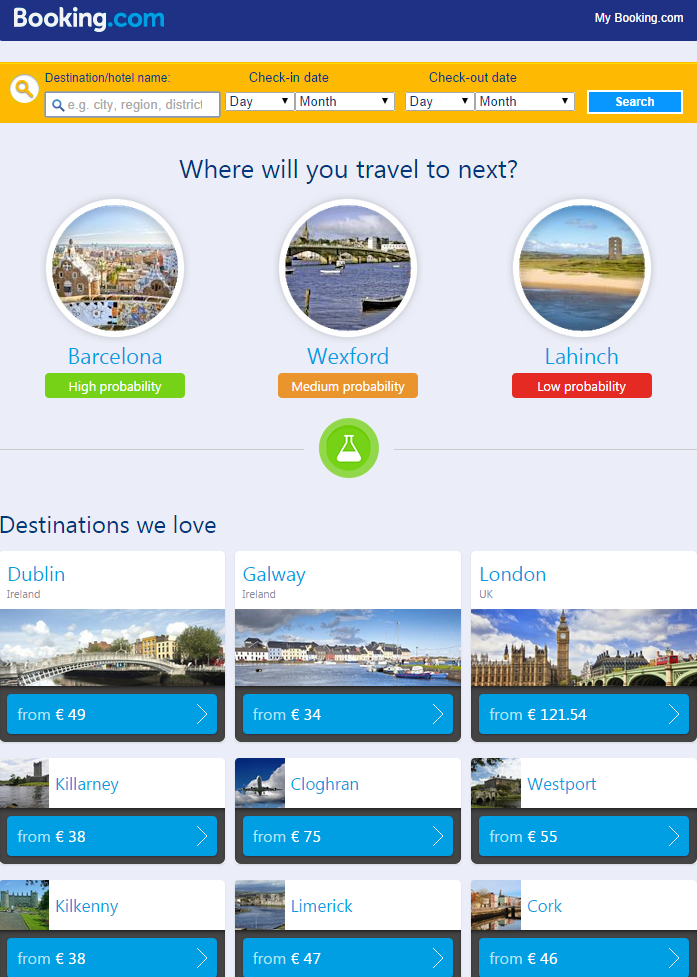
Booking.com is an online accommodation reservation service with over 135 offices in 59 countries. They run a truly global business. Their newsletter is sent out to subscribers who have an existing account or have subscribed to their newsletter.
Here are the main features from their newsletter
Photography
Each destination photograph has been carefully chosen to represent a city. Blue skies, sunshine, beaches and historic architecture make the cities look appealing and evoke the subscriber to think about a “great escape” for the weekend.
Lesson: Include images that look good and evoke an emotional response from your subscriber.
Personalisation
The email has been personalised to the subscriber. From the account details Booking.com has tailored suggested locations for the subscriber to visit. Personalising the newsletter helps to provide relevant holiday ideas to the subscriber which improves the chances of repeat bookings.
Lesson: Use email list segments to personalise your emails. Tailored content can help to deliver a better user experience and improve conversion rates.
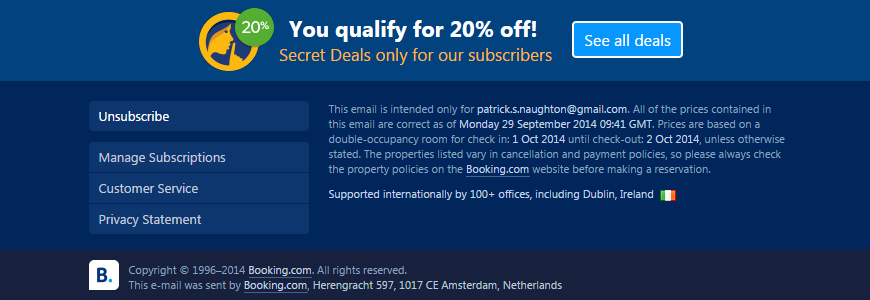
Secret Deal for Subscriber
The bottom of the newsletter includes a deal “only for subscribers”. The deal is an incentive to help increase the rate of repeat customer’s signs ups.
Lesson: Special offers only for subscribers can help to increase repeat sales.
Chain Reaction Cycles
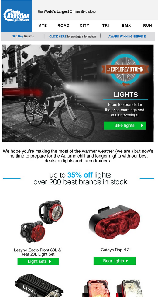
Chain Reaction Cycles are a Northern Ireland based company that provide a full spectrum of bikes and related equipment. They send out regular themed newsletter to their subscribers promoting products and special offers.
Let’s look at the design and content features
Photography
The banner image captures the theme of the newsletter by showing a man cycling in the evening with his lights eliminating his path. The photograph immediately gets the subscriber thinking of cycling in safety during the dark Autumn evenings. The front and rear lights tie into this idea seamlessly.
Lesson: Use a banner image that represents the theme of your newsletter.
Calls to Action
The calls to action in the newsletter are clear and stand out from the design. The goal of the newsletter is get subscribers to click through to the products and categories and this is achieved with the calls to action design.
Lesson: Use calls to actions that will get noticed and will stand out from the rest of your newsletter design.
Seasonality
The newsletter is timely. The newsletter was sent out at the beginning of Autumn and the content and products reflect this. Chain Reaction Cycles have provided re-active content that is planned and works to provide customers what they need, when they need it.
Lesson: Think about the timing of your newsletter send. Can you be re-active and create content that will be timely and relevant to your subscribers?
Can you use any of these ideas when designing and developing content for your next newsletter? Let us know through our social media channels.
If you need practical advice on newsletter design or content ideas, talk with one of the Ezine.ie team.