Optimising Email Marketing For Mobile Devices
In the past, it used to be all about what you couldn’t put in your email. Older computing systems simply hadn’t the power to process a lot of digital data, such as moving images, audio and large attachments. That’s all changed as technology has advanced and broadband speeds increased. Today, even the largest emails can be downloaded almost instantaneously.
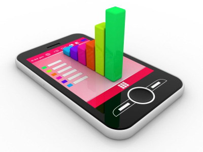
However, a new revolution is taking place – one that is creating a new set of challenges for email marketers. More people than ever are downloading and viewing email on the move using Smartphones and tablets. Email marketing for mobile devices means customising your campaigns for smaller screens, slower download speeds and for the habits of customers outside their home environment.
Browsing on the Move
It’s not something email marketers can choose to ignore. All the statistics point to the fact that more customers than ever are responding to email marketing for mobile devices. These people are increasingly choosing to make purchasing decisions while on the move.
Between 2011 and 2013, emails opened on mobile devices increased by around 30% and online mobile purchases are still rising month-on-month. m-commerce is becoming big business. Surveys show that 60% of consumers in the UK and Ireland now make at least one mobile purchase every month and the rate of uptake is still increasing.
Maximising mobile sales means optimising your email marketing for mobile devices
Remember email marketing design is a vital ingredient for success on mobile devices. Even the best content won’t deliver results if a customer opens an email to be presented with an incomprehensible screen filled with broken layouts, unreadable fonts and dead links. They simply aren’t going to go any further. For you, that means no response and no return on your investment. Worse still, it could result in customers unsubscribing – simply because they are unable to read what you send them.
Tips for successful email marketing for mobile devices
- Accessibility before beauty – Keep it simple and user-friendly. Make clickthrus easy, even for those not used to mobile devices with clickable areas around 50 pixels – keep text readable at around 14px. Avoid links close to each other, as this can result in the user clicking the wrong link. And we all know how frustrating that can be!
- Keep it fast – Mobile data speeds, although catching up, still aren’t fast enough to render large amounts of graphical data quickly – users get bored waiting. Compress images in emails to under 20kb. Create a ‘text-only’ version for users that select the ‘text-only’ option on their devices.
- Lose weight – 600 pixels is the standard width for viewing emails on a desktop PC. For Smartphones, this needs to be around 300-400 pixels.
- Start at the beginning and close with the sale – On mobile devices, users will read from the top scrolling down, so ensure your content flows logically too. Test your email on a full range of devices before sending to make sure it functions and reads well. Most importantly, make sure clickthrus, such as the ‘buy’ button, are highly visible and in the best position to elicit a response.
Need help with your email marketing? At Ezine.ie we offer a tailored email marketing service to help your business get more leads and sales. Check out our pricing page for a range of options.